Le Fleur Rouge

Services
Branding
Creative Direction
Client
Le Fleur Rouge
Year
2025
Project Overview
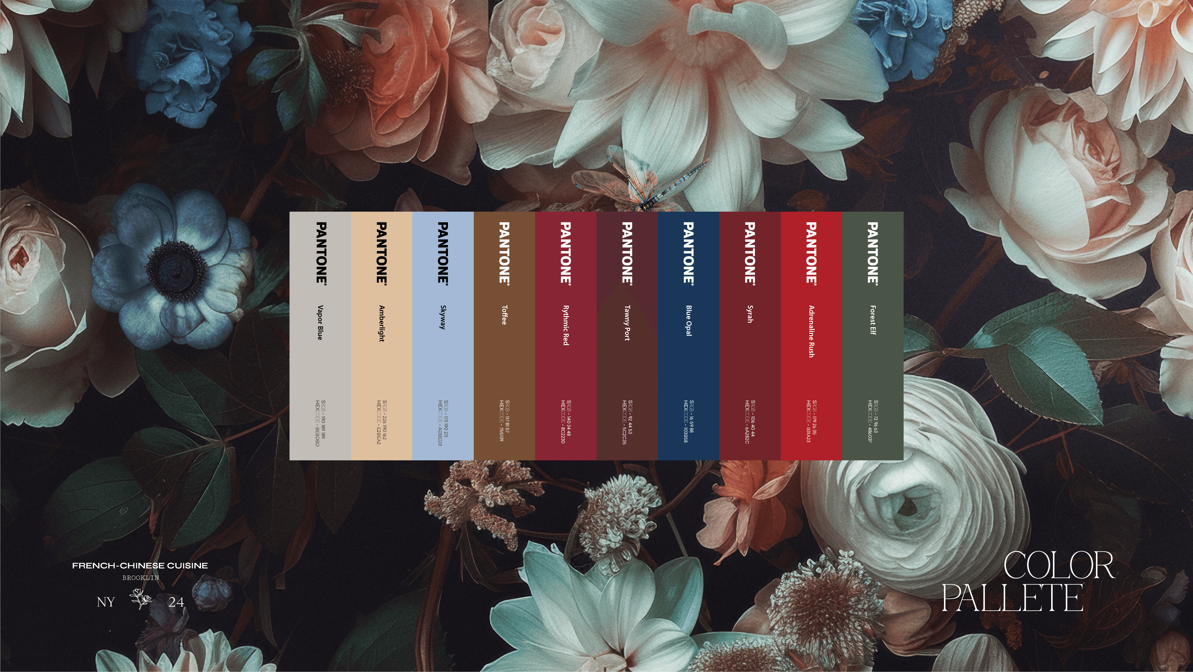
La Fleur Rouge is a Brooklyn restaurant built around contrast, warmth, and refinement, bringing together French culinary technique with the depth and soul of Chinese flavor. The branding needed to hold that same balance: elegant but expressive, polished but full of feeling.
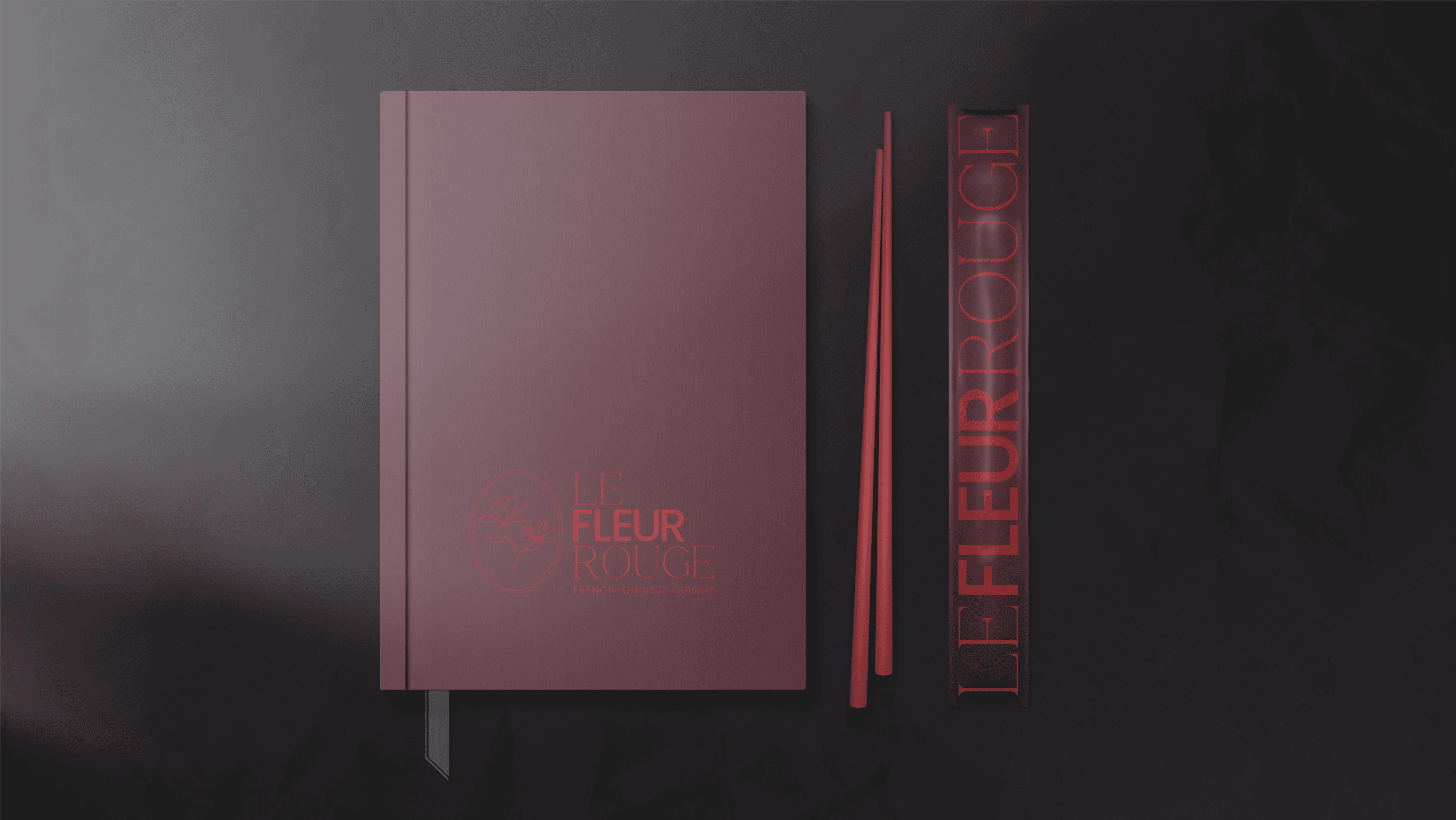
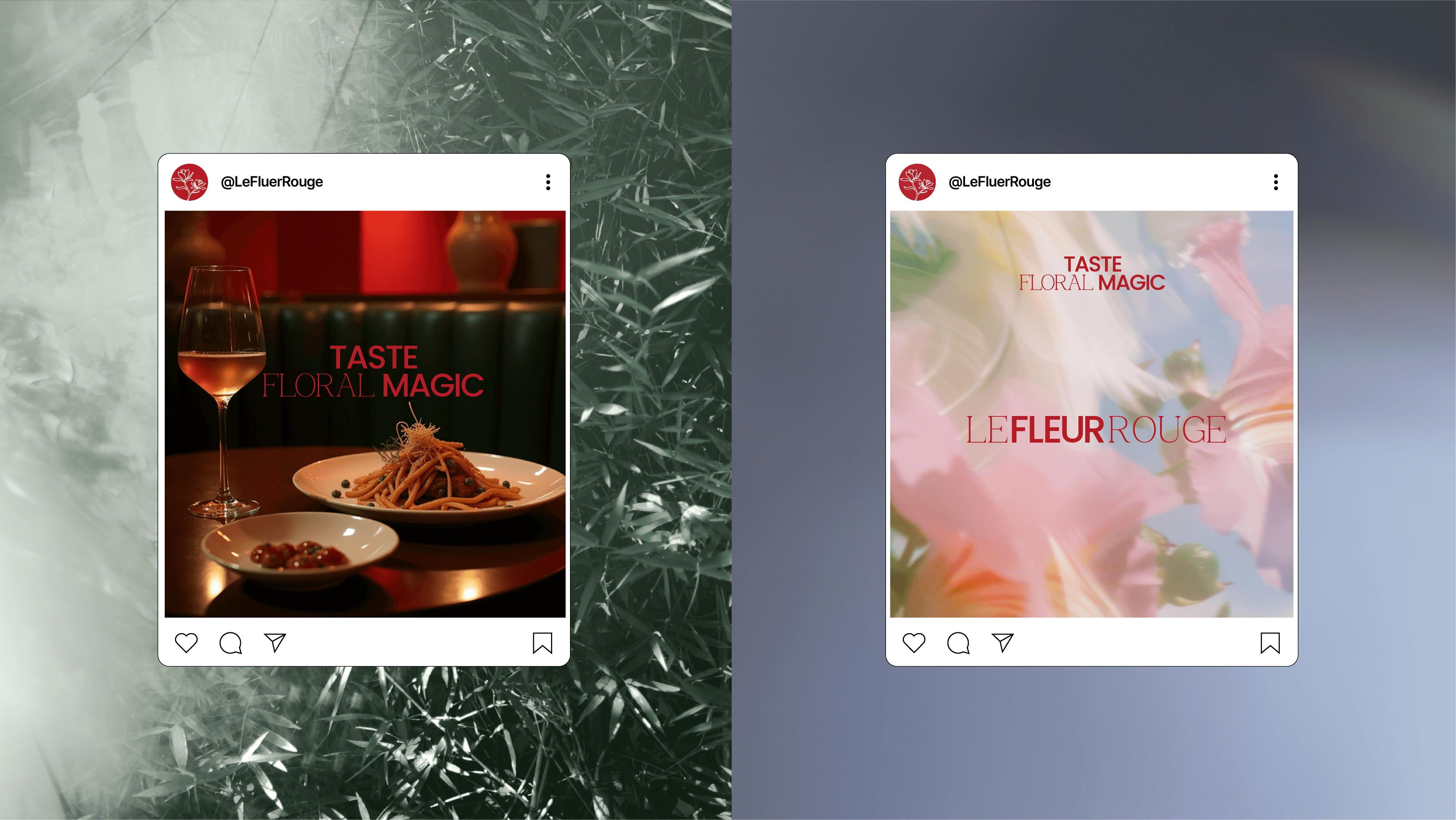
We refreshed the visual brand language with a new logo mark, refined typography, richer graphic direction, and a more cohesive system for digital and physical touchpoints. The goal was to create an identity that felt intimate, romantic, and elevated while still leaving room for the energy of the restaurant, its cocktails, live jazz events, and cultural atmosphere.
The project included a rebuilt VBL, new logo mark, social media content, jazz event posters, and supporting brand collateral. Across each piece, the system leans into mood, texture, and rhythm, creating a brand presence that feels cinematic, warm, and distinctly La Fleur Rouge.